Create a socio-political media campaign investigating how messaging campaigns are designed to inform and influence public opinion.
The project was divided into three sections: - Experimental Poster - Atlas (Publication Design) - Social Responsibility Campaign
My Contributions
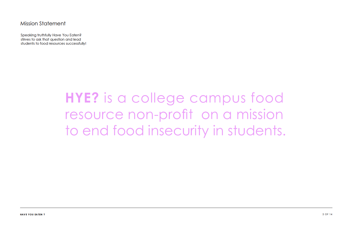
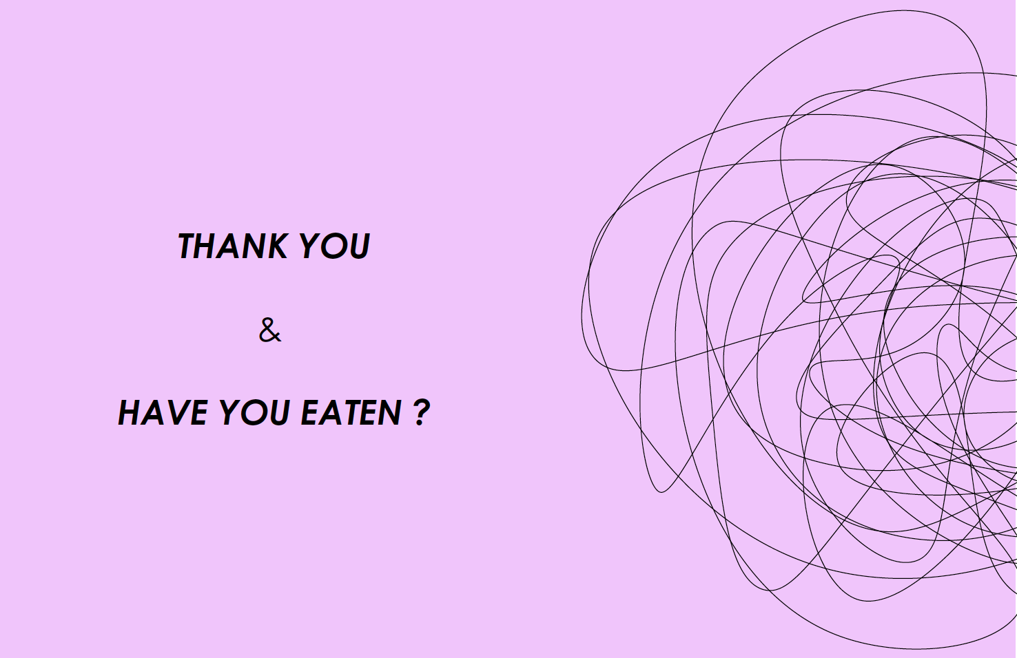
I chose Food Insecurity on College Campuses as my socio-political issue based on how dangerous hunger is within the lives of first-generation low income students. Most of these students, such as myself, tend to also be Black, Indigenous or People of Color and LGBTQIA+. I saw a space to gather all food resources on campus and comilpe them into a one-stop shop of access. With the inspiration of Parent TikTok bento lunch videos, Have You Eaten? was starting to develop into a source of compassion.
Experimental Poster
Paper medium & Black letters
3 Hours
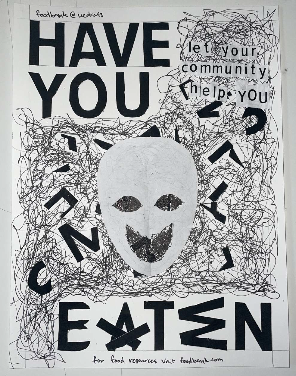
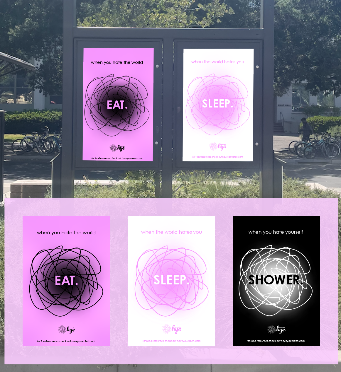
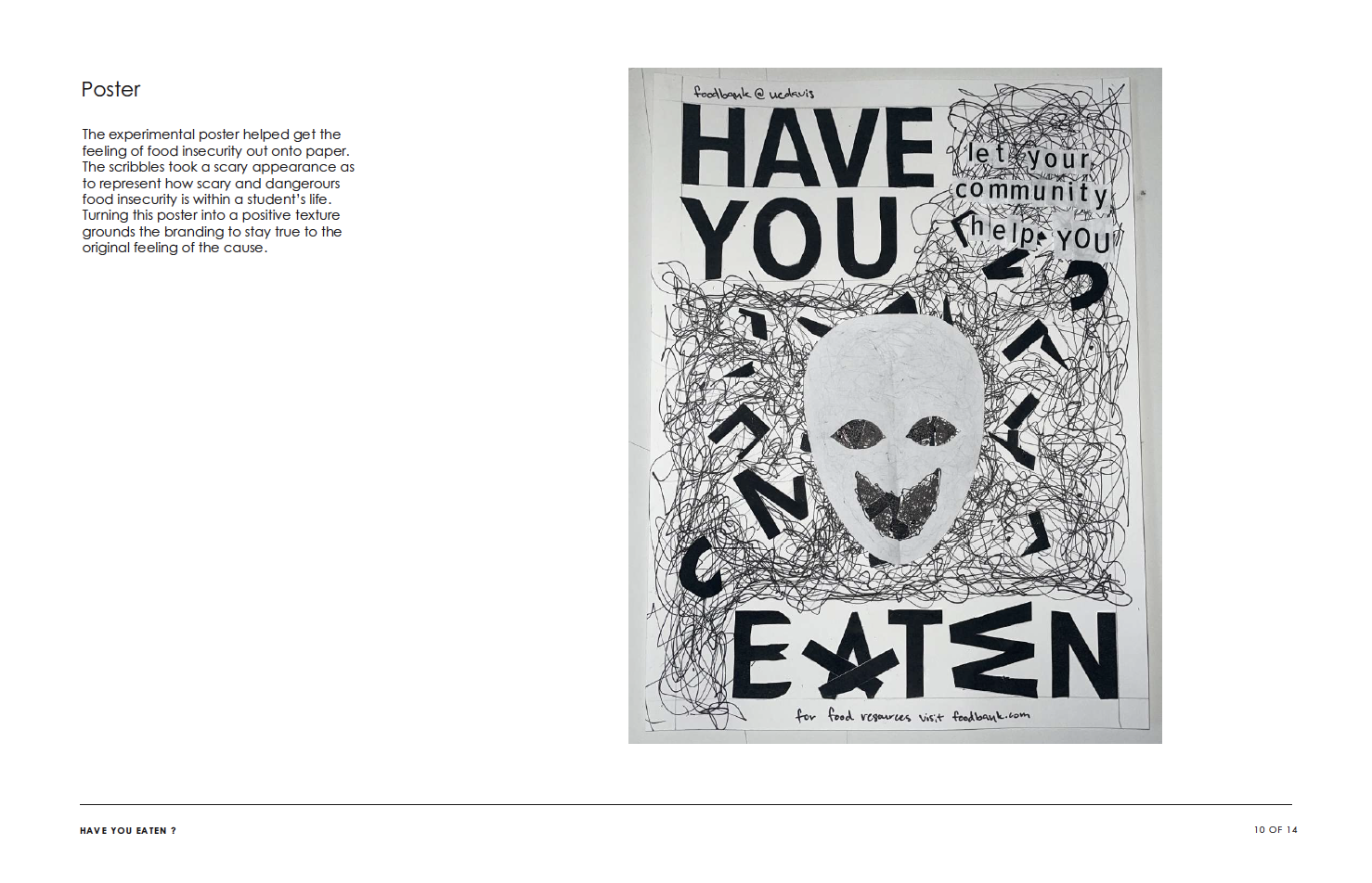
After doing enough research to understand what food insecurity is, I allowed for my feelings to guide my process. I knew "Have You Eaten" was going to be the slogan as it relates to loved ones checking in on you and expressing their love through food. However when I didn't have enough letters to complete the phrase, the subtext came to me instantly. I used the rest of the alphabet community to help finish the slogan!
The layout was slowly coming to life as I added to the poster. I then cut out a head to represent a student with the scribbles as extremely loud and unsettling noise. The scribbles represent the rumbling of a stomach, hunger, stress and how chaotic food insecurity really is. Letting my feelings out on the poster truly visualized the problem that I was aiming to provide a compassionate solution for. This exercise has now become a pivotal first step in my design process.
Atlas
Publication Design
3 Weeks
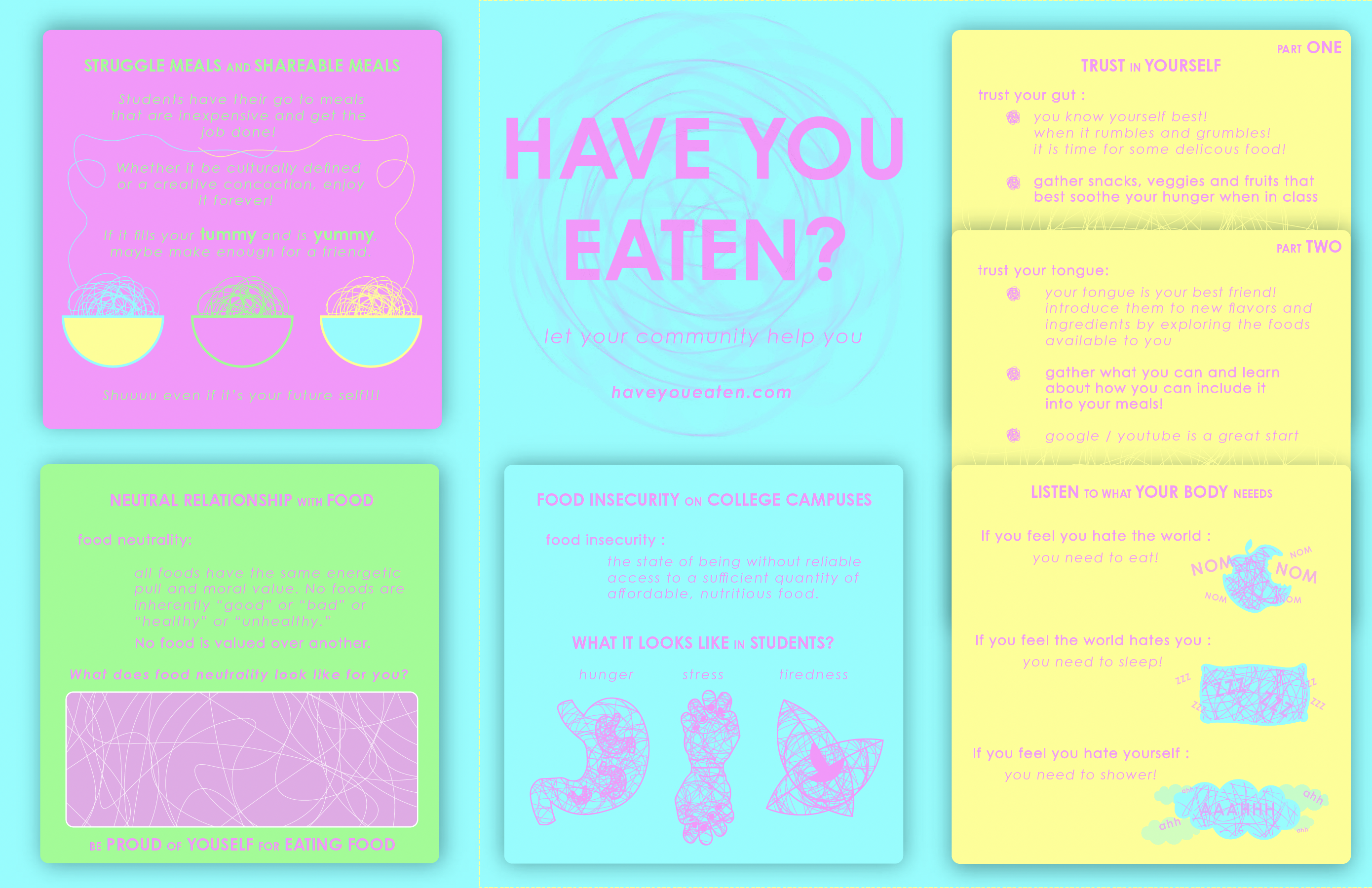
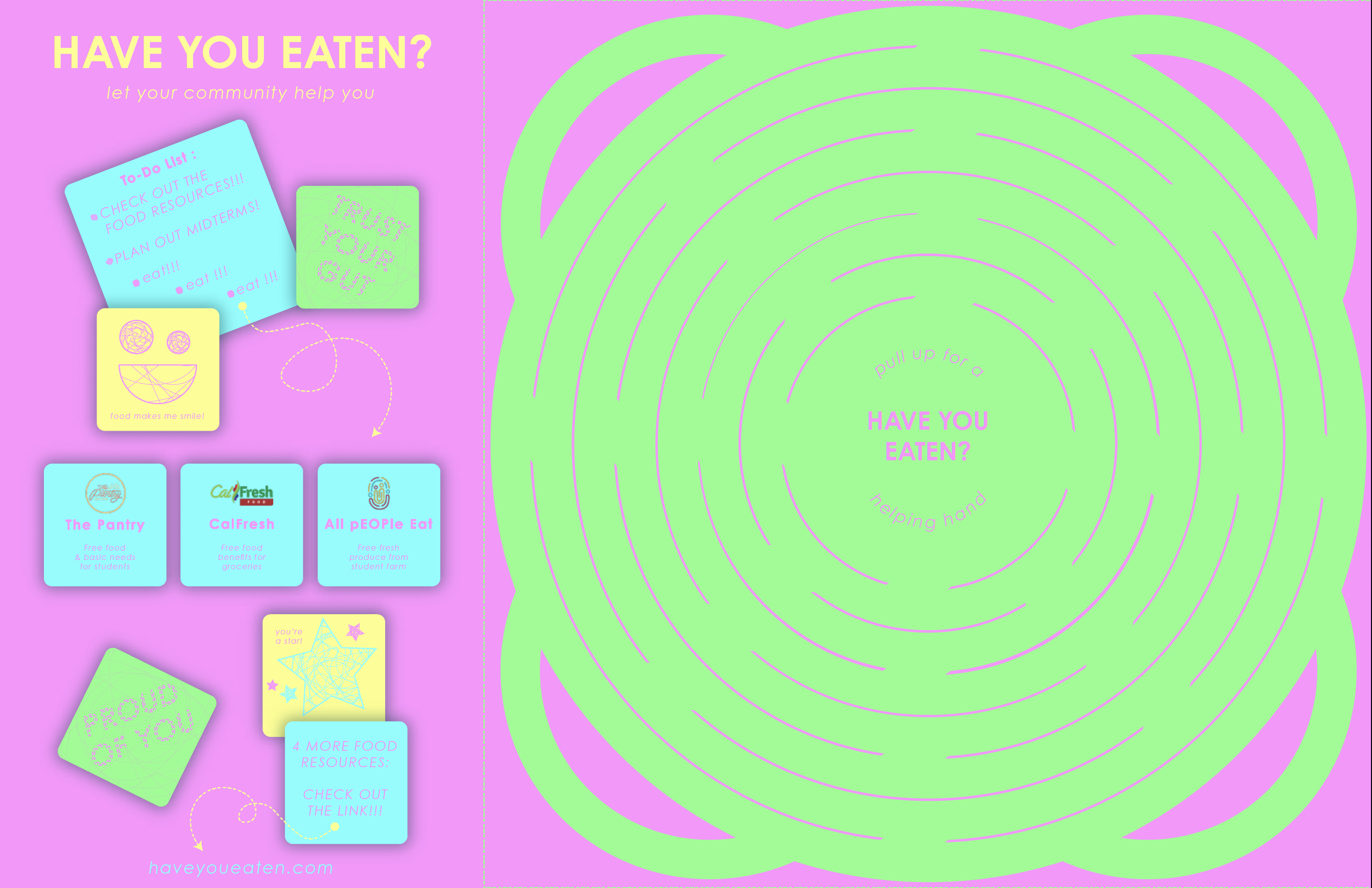
Moving into the next phase, an informational physical atlas needed to be made and have a transformative quality that allowed our community to interact and learn from it. After many many iterations and prototypes, this post-it note themed brochure came to life. I was inspired by Parent TikTok and how much love was embedded into the lunches they made for their children and the loving notes they hide inside.
I wanted to replicate that feeling and give some to college students who might not have someone checking in on them and feeding them and telling them how much they love them. Have You Eaten would take on that role and relationship. Providing holistic activities and journaling opportunities, the atlas embodied a positive, colorful and welcoming tone that felt appropriate for this topic.
As for the interactive component, I was inspired by Taiwanese Boba carriers made out of a flat plastic sheet with incisions that would transform into a bag when lifted. I studied the process and replicated it to fit the needs of college students taking their food resources home in this make shift bag.
Social Responsibility Campaign
Brand Identity & Strategy
7 Weeks
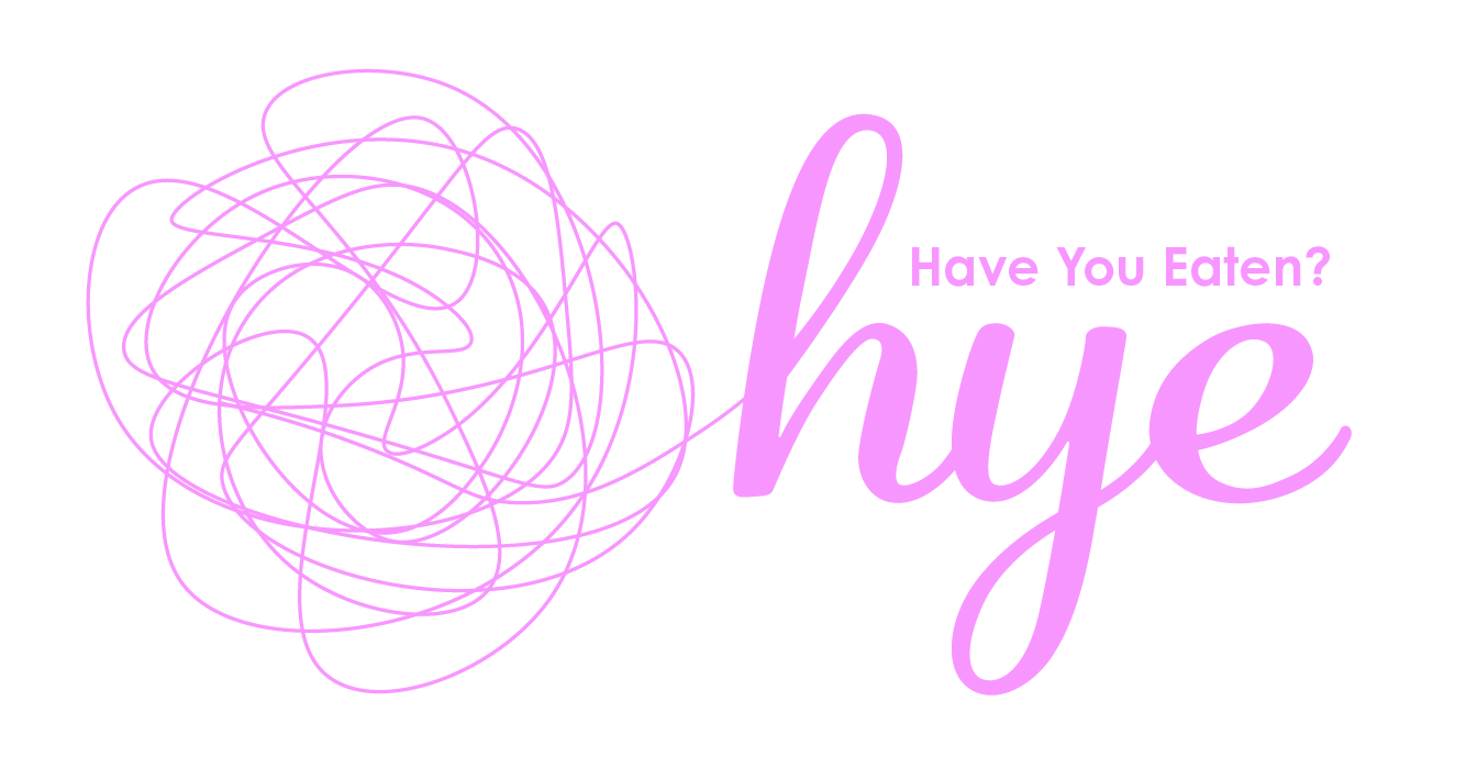
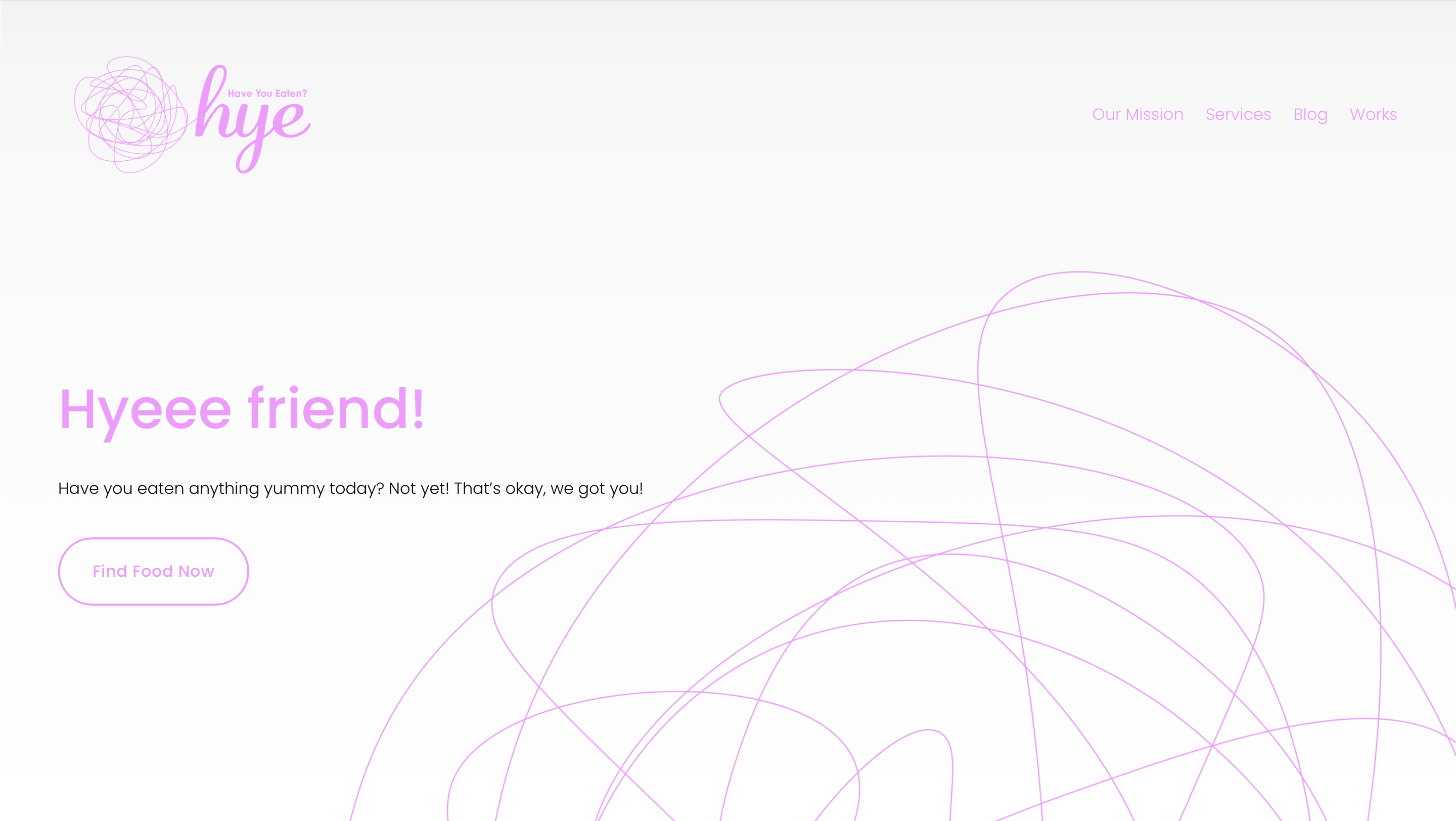
Combining the feelings of food indesurity and the tone of my atlas, the campaign truly blossomed on its own. The logo stems from the sricbbles and transforms into a scripted "HYE." A new take on Hi and pronounced like Bye!
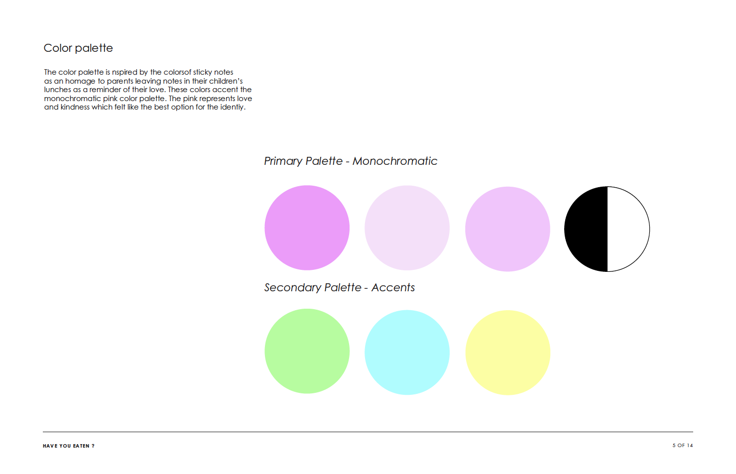
The vibrant pink took over and made so much sense. Pink is a welcoming and caring color which worked perfectly for Have You Eaten. It captured the essence of what a solution for food insecurity on a college campus can look like.
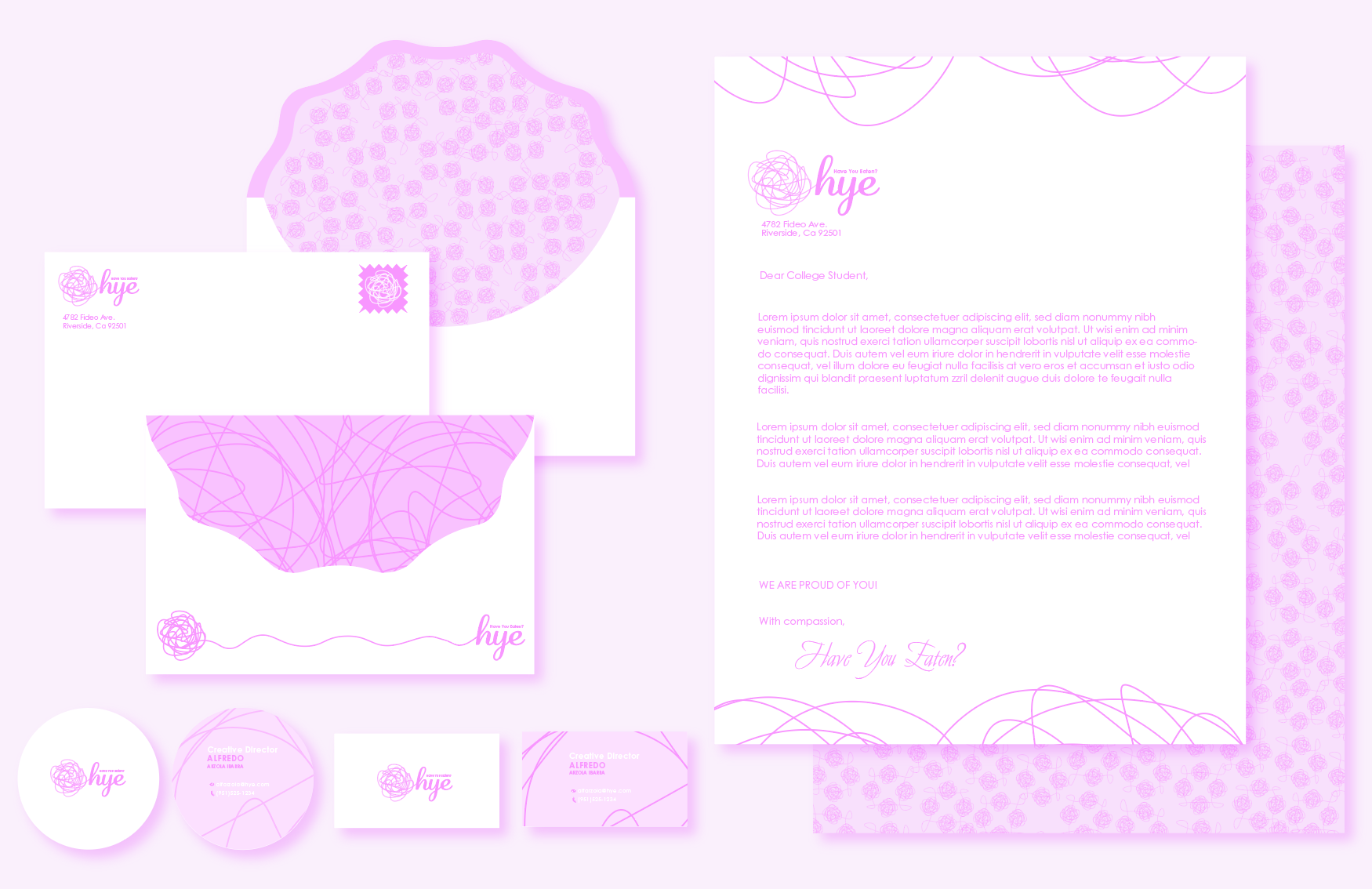
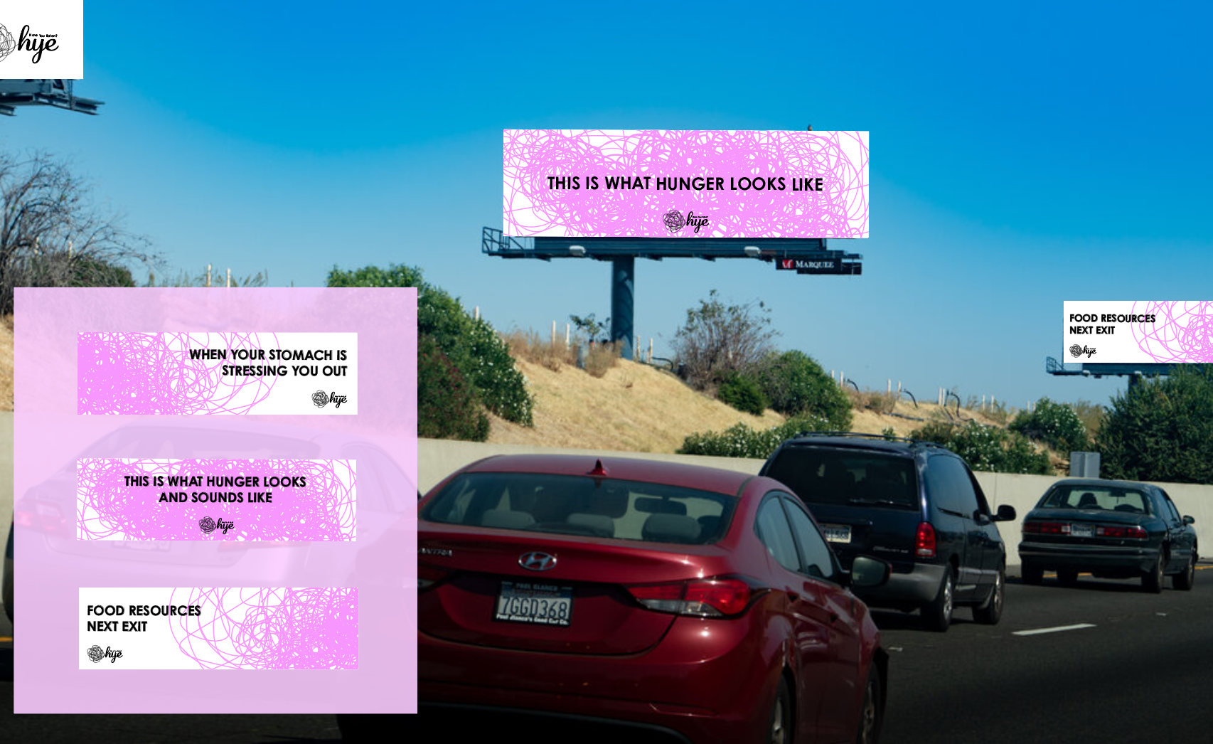
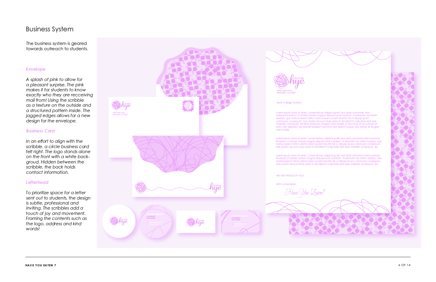
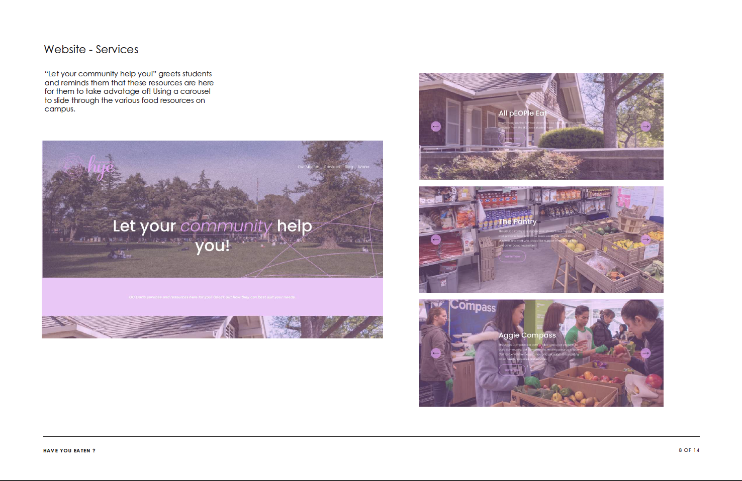
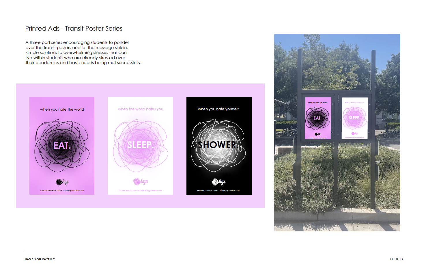
Finally the brand identity jumped out from anywhere it was paired with. Living in an accessible website linking active food resources on the UC Davis campus that has helped myself along with many students be fed and happy. To the professional collateral such as envelopes, business cards and letter heads that would be geared towards reaching college communities. Finally to the highway billboards leading into Davis guiding students to resources and bus transit posters that allow students to check in on themselves and figure out what they needed.
Overall, Have You Eaten has developed into a compassionate guiding hand to food resources and basic necessities. Students should only worry about being students. Next time you are with a loved one, check in on them and ask:
HAVE YOU EATEN?
Final Presentation
Social Responsibility Campaign
Brand Identity
Professional Collateral
Website & Sinage
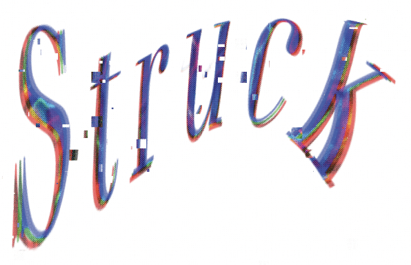
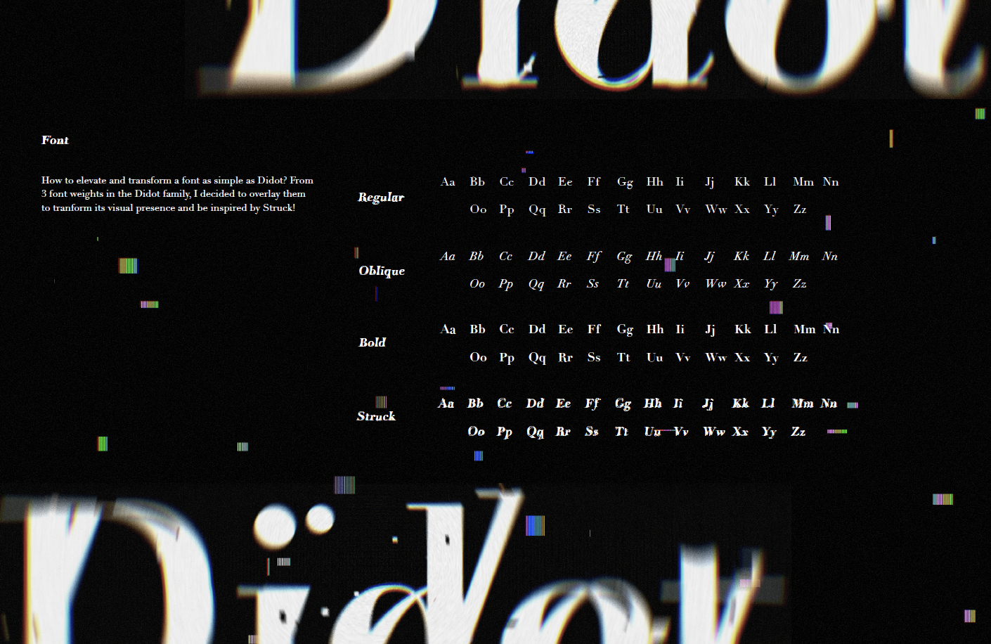
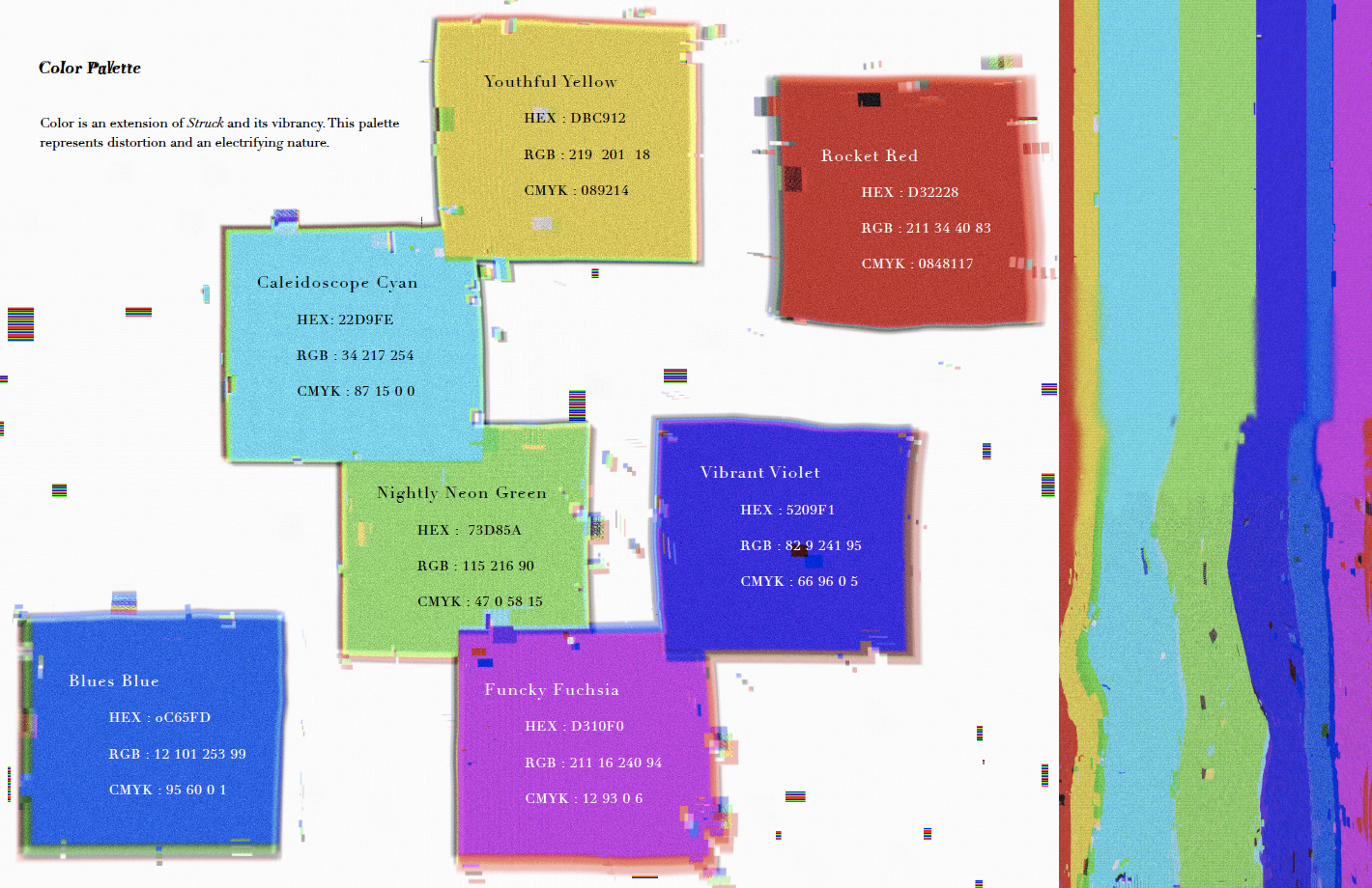
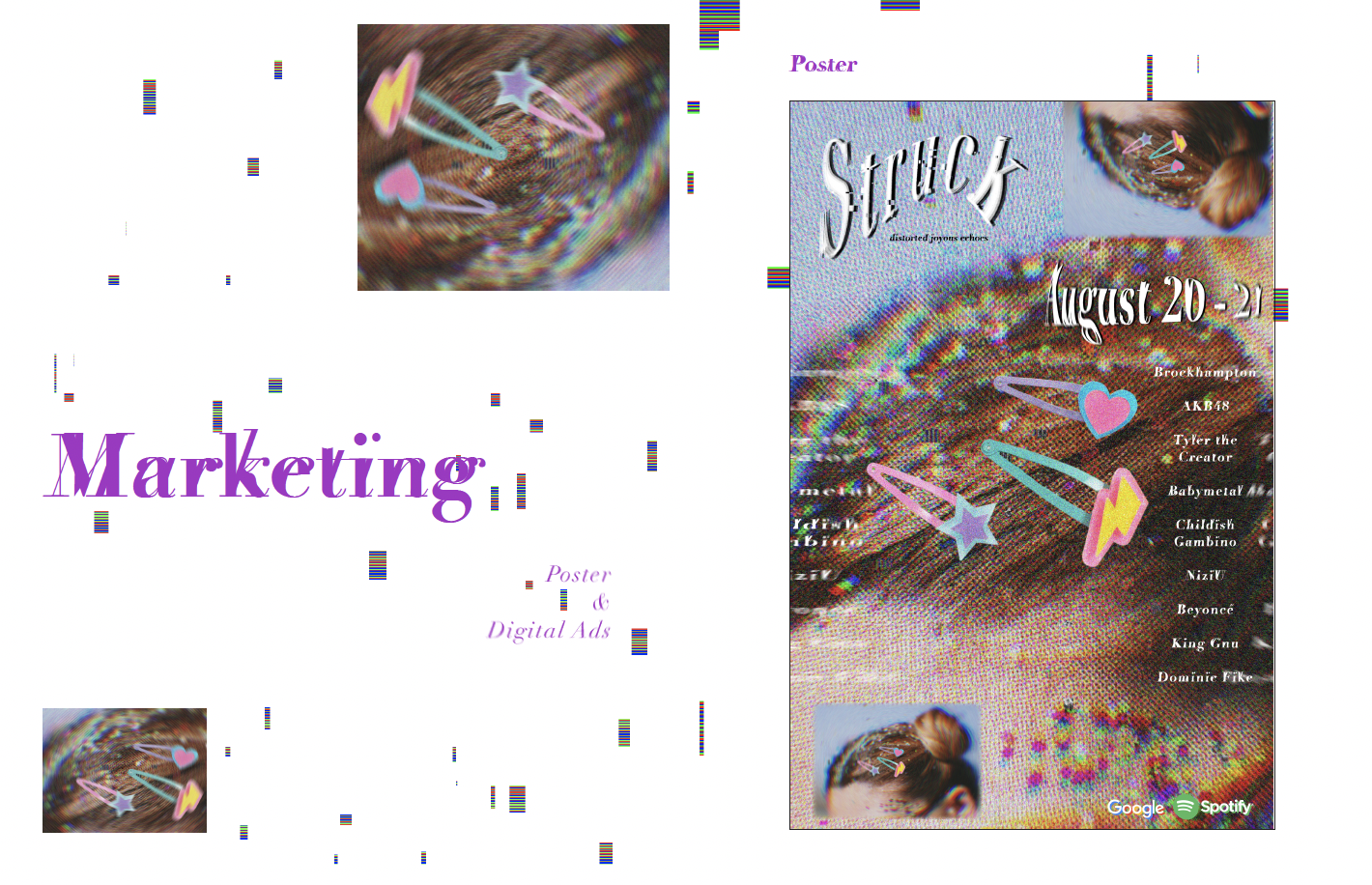
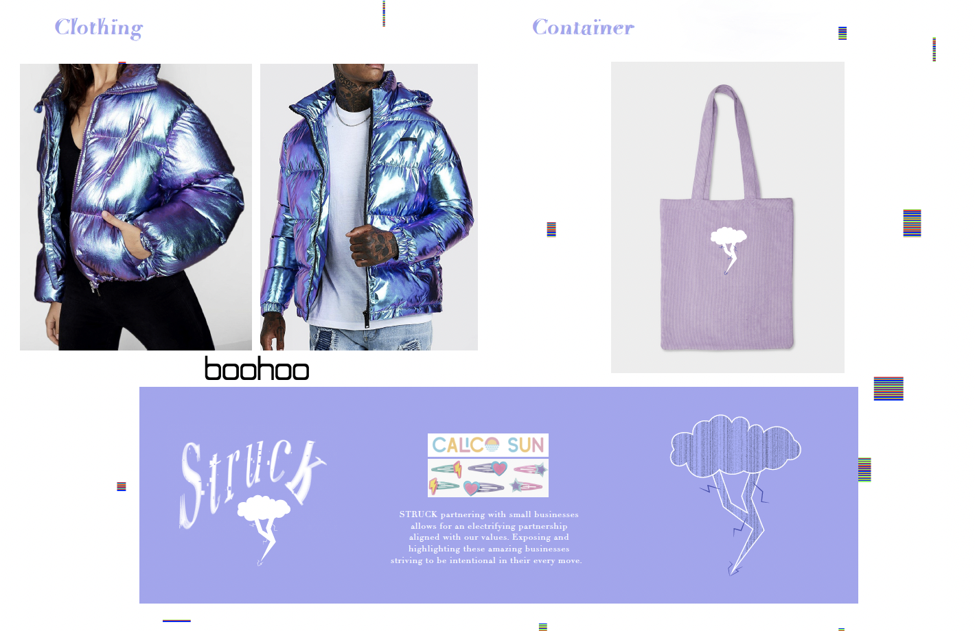
STRUCK
DES 116 : Visual Communication
Project Overview
Create Visual Communication for a music festival combining two music genres and making them read as a cohesive brand identity.
The project was divided into three sections: - Logo - Branding Guidenlines - Festival Collateral
My Contributions
Bringing together Japanese Pop and Alternative Hip-Hop, STRUCK came to life within this playful, kaleidoscope-esk and electrifying fusion. I chose to experiment with textures and layering them on until it felt like lightening striking in one place from two different worlds. A sonic bomb of sensation and an ultraviolet cloud of appreciation, STRUCK is a love storm to these two genres and creates a world where self-aware life-loving people can bop together within their compassion.
Final Presentation
Complete slide deck for visual communication.
Mission Statement
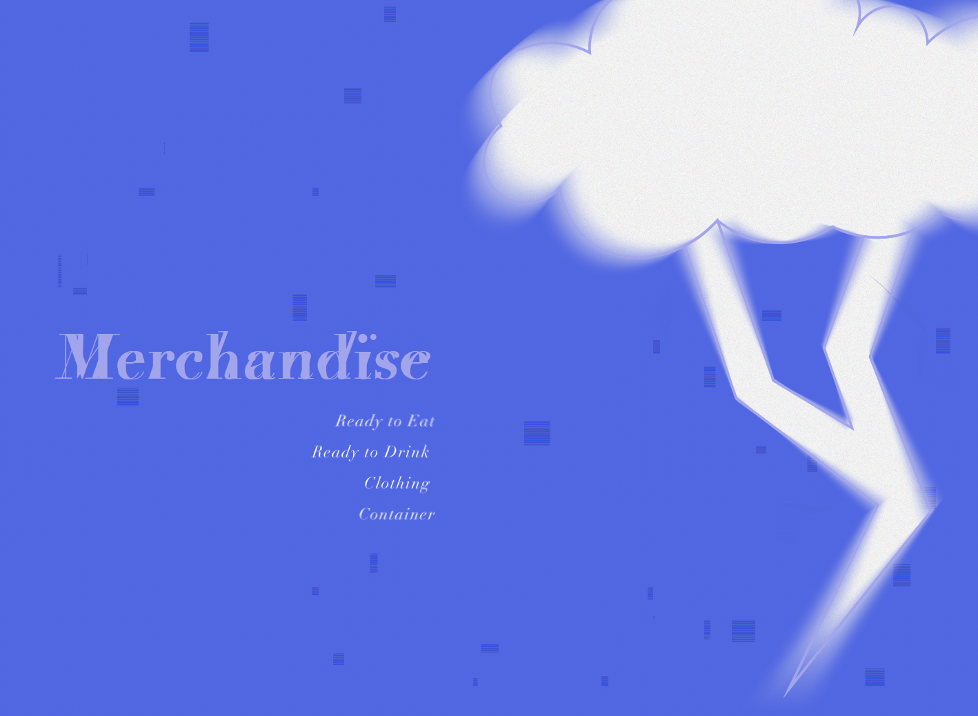
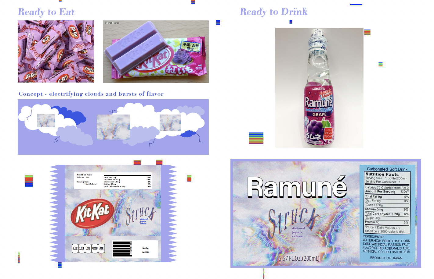
Merchandise
Ready to Eat & Drink
Clothing & Tote
the metamorphosis
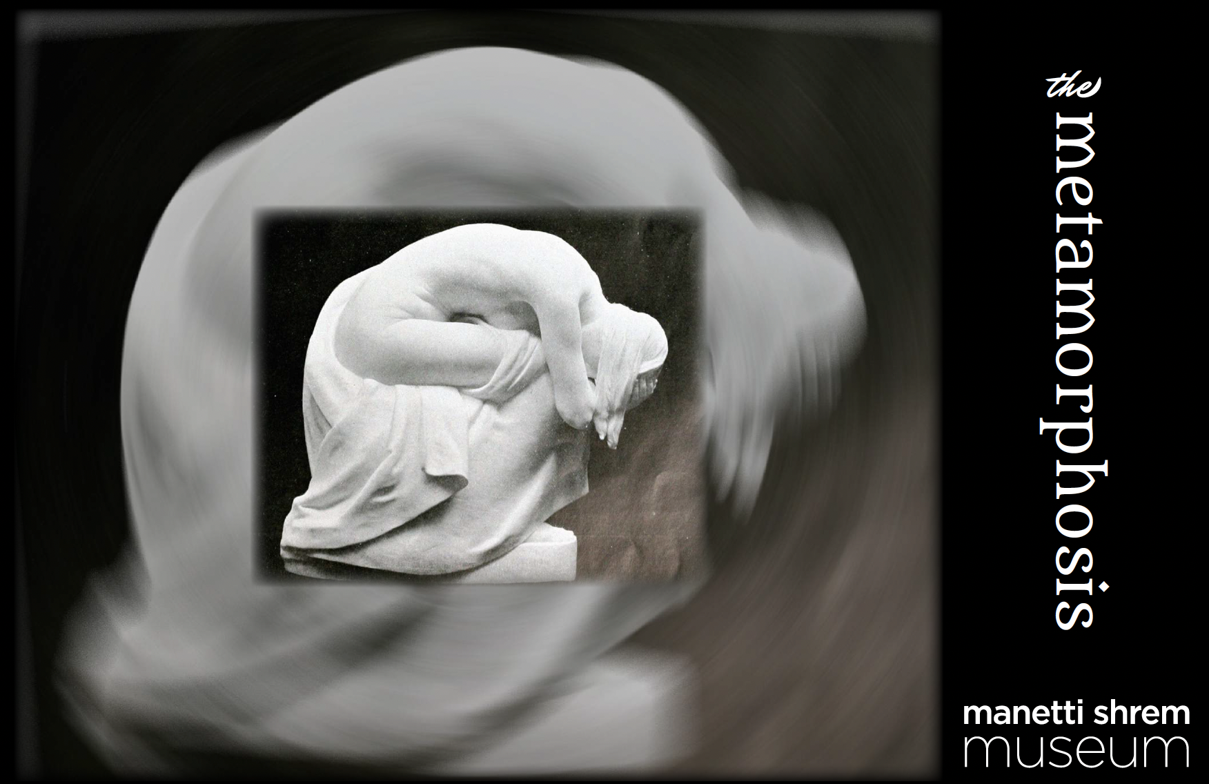
DES 185 : Exhibition Design (Proposal)
Project Overview
Create an Exhibition Design Proposal for the UC Davis Manneti Shrem Museum. Working in teams of 3, develop an exhibition topic and plan out how it will exist in the space.
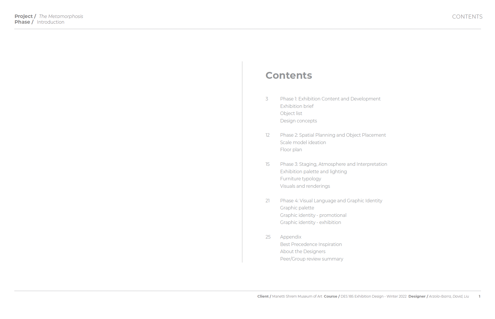
The project was divided into four phases: - Exhibition Content and Development - Spactial Planning and Object Placement - Staging, Atmosphere and Interpretation - Visual Language and Graphic Identity
My Contributions
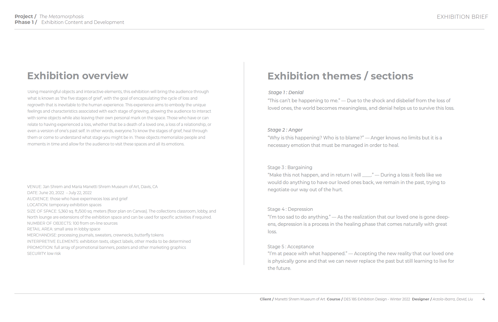
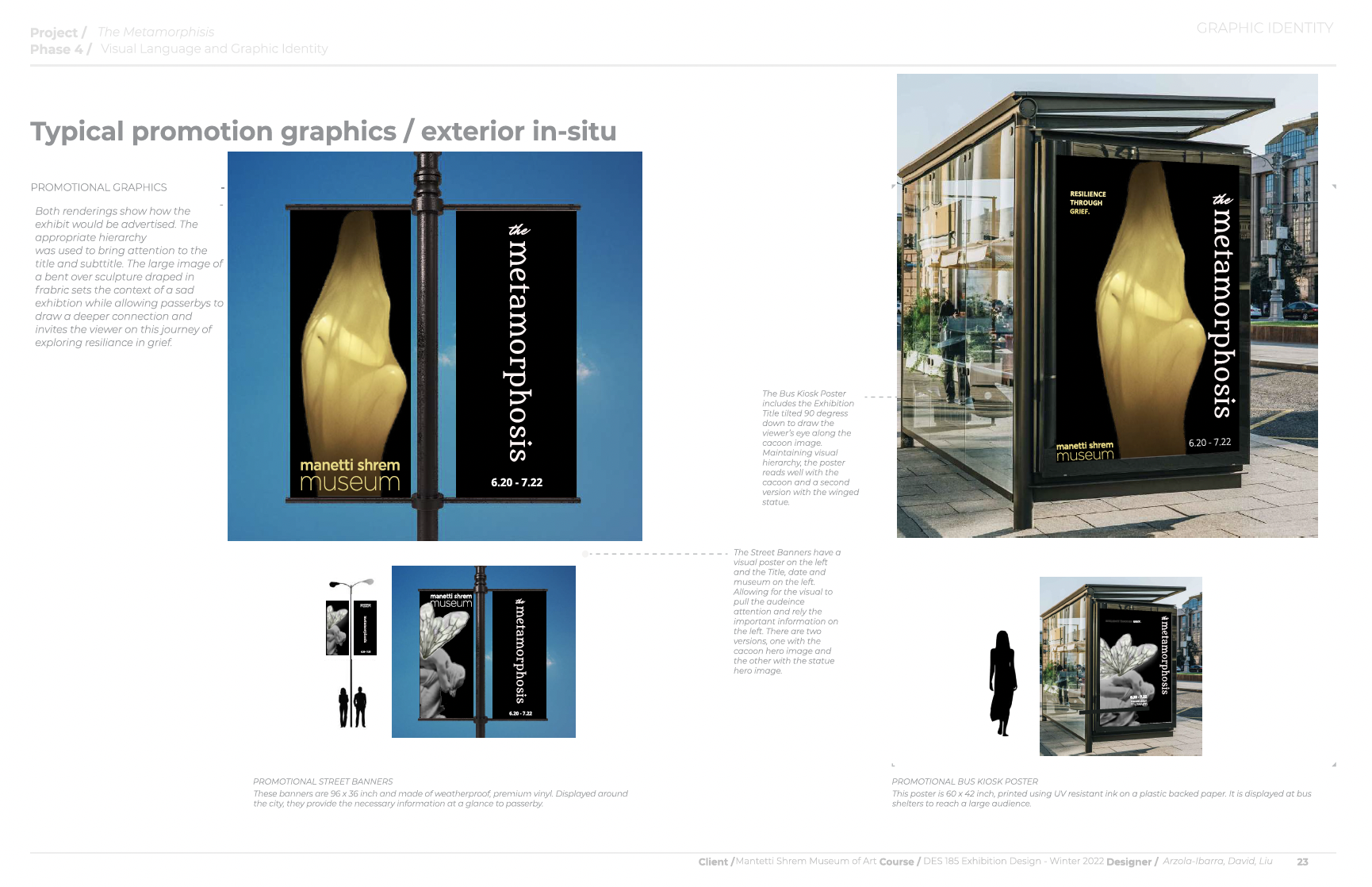
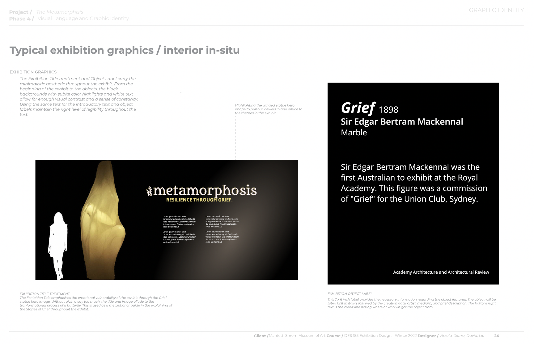
Conceptualization and storytelling will forever be my strong suit, so when we were given the RESILIENCE theme, my mind began to race. Once paired up, my team and I came to an agreement on our theme: Resilience through Grief. I pushed it further by having the space tell the story of the Five Stages of Grief through the transformative process of metamorphosis. Combining these two avenues truly allowed for us to play around with the objects and design the space accordingly.
A level of grace and compassion was used to talk about such heavy topics however filtering it through the butterfly life cycle gave it a hopefulness we were hoping for. The brand identity was where I thrived, setting the feeling and tone for the exhibit along with my team. We worked extremely well together and is currently my favorite collaborative project EVER!
Overall, the metamorphosis represented a transportive process that looks very different for everyone and highlights the objects that helped us get through our collective and individual grief.
Want to work together?
If you like what you see and want to work together, get in touch!